7/3/2026
Onboarding
How to Onboard Clients Who Hate Being Onboarded
Some clients sign the contract and then refuse to participate in onboarding. They are not being difficult. They are telling you something about your process.
Whether you're onboarding new clients, collecting documents, or building intake forms, we'll help you get organized.
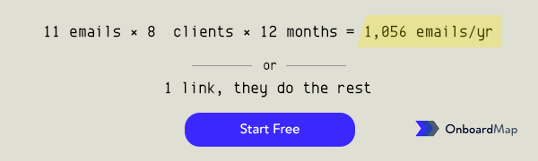
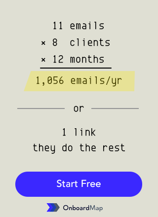
OnboardMap replaces email chaos with one link. Clients complete every step. You see progress instantly.
")
TLDR: Login requirements kill client portal adoption. Every step in an account creation flow — username, password, email verification, CAPTCHA — reduces completion rates by 10-20%. Magic links eliminate all of that friction: clients click one link and land directly in their portal, no credentials needed. Portals with magic links see 80-90% completion rates versus 40-60% for those requiring logins.
You invested time setting up a client portal. You configured the branding, built the intake flow, wrote a nice welcome message. Then you sent the link to your first client.
They clicked it. Saw “Create an account to continue.” And closed the tab.
This happens more than you think. Login requirements are the single biggest friction point in client portals. And most portal tools treat them as non-negotiable. They are wrong.
Your client just agreed to work with you. They are motivated. They received your onboarding link and clicked it within minutes. They are ready to upload their documents and get started.
Then they hit a login screen. Now they have to:
That is five steps before they even see what you need from them. Each step is a chance for them to get distracted, frustrated, or simply decide to do it later. “Later” often means never — or at least not without a follow-up email from you.
Research on form abandonment consistently shows that every additional step reduces completion rates by 10-20%. A five-step login flow can cut your portal adoption in half before a single document gets uploaded.
When clients do not complete their portal, they do not say “your login process was annoying.” They say:
That last one is the killer. You built a portal to replace email, and the login friction is pushing clients right back to it.
A magic link is exactly what it sounds like. You send the client a unique, secure URL. They click it. They are in. No account creation. No password. No friction.
Here is how the experience looks:
That is it. Three seconds from email to action.
Magic links work because they flip the authentication model. Instead of “prove who you are,” it is “you received this link in your email, so we know who you are.” The email address itself is the verification.
Yes. Magic links are:
Banks and healthcare platforms use similar approaches for secure document access. For a client portal collecting tax documents or signed agreements, magic links provide more than enough security.
Portals that require account creation typically see 40-60% completion rates. Clients start the process but never finish because the friction compounds. Forgot password. Reset email. New password does not meet requirements. Give up.
Portals with magic link access see 80-90% completion rates. The difference is not marginal. It is the difference between a system that works and one that creates more problems than it solves.
If you are evaluating portal tools, this should be a non-negotiable feature. For a broader overview of what to look for, read what a client portal is and how it works.
Logins are the biggest offender, but they are not the only one. Here are more friction killers to watch for:
Do not make clients download an app to access their portal. A web-based experience that works on any device is always better.
Your client should land on their portal and immediately understand what to do. If they need a tutorial, the design is wrong. One page, clear sections, obvious next steps.
Every form field is a micro-decision. Keep intake forms tight. Ask only what you need to start the work. You can always collect more later.
Your clients will open the portal link on their phone. If the experience is clunky, slow, or requires pinching and zooming, you have lost them. Mobile-first design is not optional.
If you already have a portal that requires logins, you have a few options:
The best approach is to choose a tool built around frictionless access from the start. Retrofitting authentication is always harder than starting with the right model. If you are setting up a new portal, our guide on building a branded portal in under 30 minutes walks through the full process.
The entire point of a client portal is to make onboarding easier — for you and for your clients. A login wall does the opposite. It adds friction, creates support requests, and pushes clients back to email.
The best portals feel invisible. Click a link, see what is needed, submit it, done. That experience is what separates a tool clients actually use from one they actively avoid.
For a deeper understanding of how portals fit into the onboarding process, check out our complete guide to onboarding portals.
OnboardMap is built on this principle. No client logins. No account creation. Just a single magic link that takes your client straight to their branded portal. Clean, fast, frictionless. Get early access and give your clients an experience they will actually complete.
Send one link. Clients upload docs, fill intake forms, and complete every step — automatically tracked. No account required for your clients.
Austin Spaeth is the founder of OnboardMap, a client onboarding portal for service businesses. After years of watching agencies and consultancies lose time to scattered onboarding processes, he built OnboardMap to give every client a single link with everything they need to get started.
Client onboarding portal that replaces email chaos. Send one link. Clients upload everything, complete every step, and you see progress instantly.
Start For Free